Flourish | Branding & Identity
Made with Figma, Adobe Illustrator, Adobe Photoshop, Adobe InDesign, Adobe Lightroom

Flourish is a rebranding design and identity for Home of Christ in Cupertino, a Christian non-denominational church. The previous branding, Whimsy, was created at a time when the church had begun a mission of achieving familial unity through their faith and beliefs. Now, after a few years of relationship and intergenerational community building, they were ready for a rebrand that reflects their growth and strong community. I took charge of this rebrand from conceptualization to application.
Design Process

Concept Development
Theme exploration
Artifact research
Moodboard
Logo sketches
Visual elements
Iteration testing
Logo Exploration

Visual identity
Stationery system
Color & typography
Choose application
Create mock-ups
Advertising
Informational tools
Branding System
Brand Application
The mission statement since the last branding has stayed the same but the congregation is moving alongside these goals and have a grown a lot since. The recent fellowships and community events are some of the attributes to this new change. I fleshed out two brand conceptualizations that could reflect the current church.
Brand DNA
Kindred displays the lightheartedness and welcoming nature of the congregation. "Growth" is an important part of the church now so I wanted to use a flower blooming as a main element. Kindred uses light colors and a soft, delicate flower imagery that appeals to all ages and feels a bit trendier.
Flourish has a more mature and established look and feel that reflects the amount of change and progress the congregation has already been going through. The main element is a tree that has strong roots just like how the church is rooted in their beliefs. The colors are deeper with a touch of warmness from the accent color.


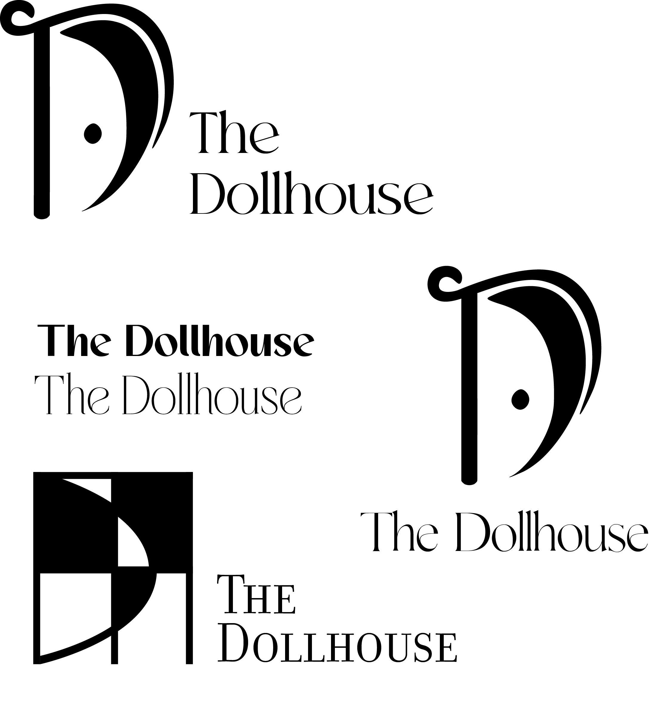
Final Logo

For the patterns and icons, I created a typographic pattern using the logo to reinforce the museum’s identity across various materials. Additionally, I designed custom icons in Illustrator representing items typically found in a bedroom, such as lamps, chairs, and decor. These icons were incorporated into the branding to add a playful and cohesive visual element, ensuring consistency across all collateral, from promotional materials to digital assets.
Visual Elements


I applied The Dollhouse branding to create cohesive, professional materials. The stationery system includes letterheads, business cards, and envelopes, all designed with the museum’s color palette and logo to maintain a polished and consistent look. The promotional flyer features eye-catching graphics, clear typography, and engaging visuals to draw attention to the museum's exhibits and events. Both the stationery and flyer reflect the playful yet sophisticated nature of The Dollhouse, ensuring the brand remains memorable and impactful across different touchpoints.
Printed Visual Assets
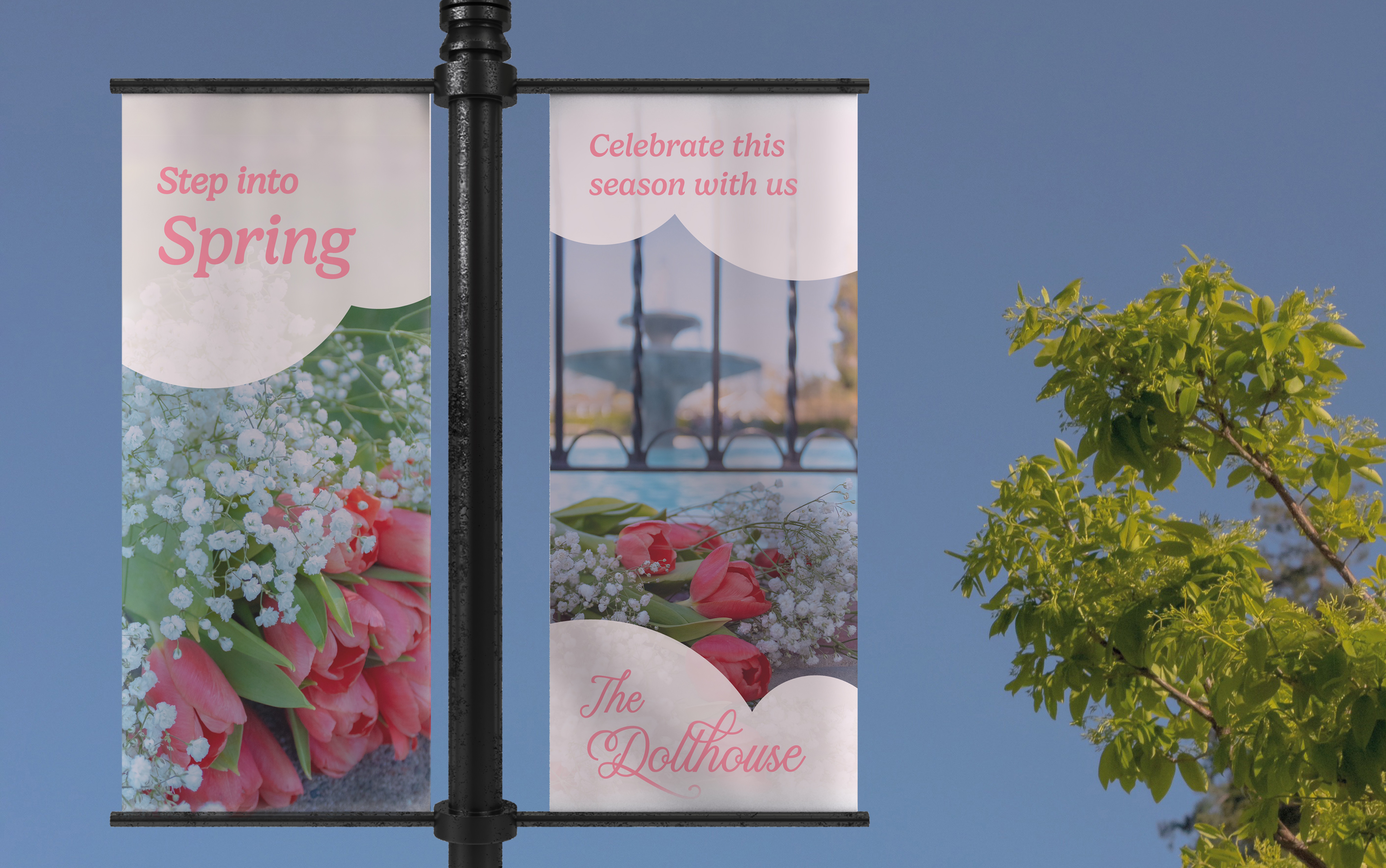
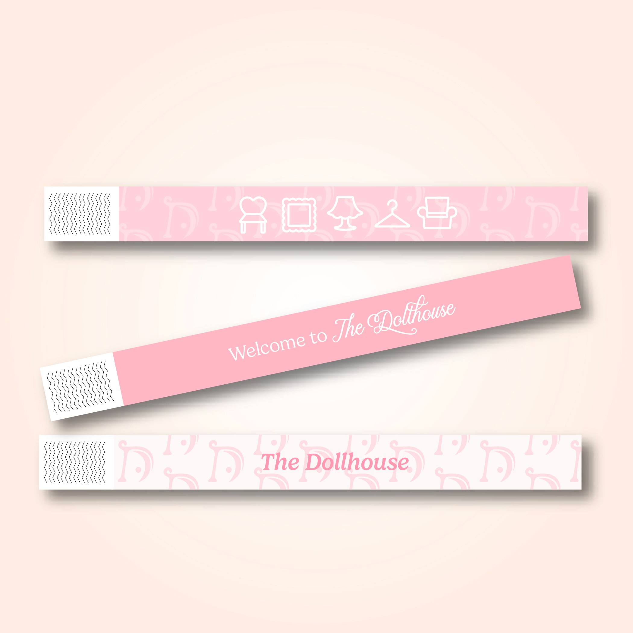
For the brand application, I showcased the versatility of The Dollhouse branding through tote bags, wristbands, a lamp post banner and website. The tote bags feature the logo and pattern, creating a bold yet playful statement, while the wristbands provide a simple, wearable reminder of the museum’s identity. The pole banner uses the logo and color palette to create an eye-catching design that stands out in any environment, effectively promoting the museum. These items help bring the branding to life, extending the museum’s identity beyond traditional materials and into the hands of visitors.
Brand Application


Throughout this project, our focus was on creating a seamless, user-friendly experience that simplifies the rebate process for energy-efficient home improvements. From research and prototyping to branding and user flows, every detail was designed with clarity and efficiency in mind. This work reflects my approach to design—balancing functionality with aesthetics to solve real problems and enhance the user journey.


Location
San Jose, CA
Contact
lucyyindesign@gmail.com
LinkedIn: @lucyyindesign
Instagram: @lucyyindesign
For The Dollhouse Instagram page, I designed a cohesive feed that reflects the museum's playful yet sophisticated branding. Using the color palette, logo, and custom icons, I created engaging promotional photos and graphics that showcase the museum’s exhibits and events. The posts are designed to capture attention while maintaining a consistent visual style, with a focus on storytelling through images and short videos. The Instagram page serves as a dynamic platform to interact with the audience, promoting the museum’s offerings while reinforcing its identity and mission in an accessible, engaging way.
Social Media